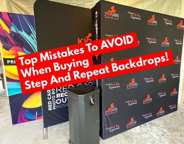
I am not one for rules – so coming up with a set of hard and fast ones is no easy feat. These however should keep you on the right track to an awesome looking step and repeat.
DO: Use a contrasting background color – gradients, colors and textures all make for awesome pallets to showoff brands on backdrops!
DO: Include a way to engage (hashtag, QR code, SM information)
DO: Use vector logos (much better print quality)
DO: Place something fun behind where your guests will be standing. (ie. Event name, an invitation to get dressed up etc)
DO: Keep in mind the the way your photographer will frame her shots.
DON’T: Fade out logos – it often just comes across as washed out or faded
DON’T: Make your logos too big or too small (keep in the range of 2.5″ tall to 8″ tall)
DON’T: Squeeze your logos together – leave at minimum the equivalent of a logo above, below and beside of white space
DON’T: Make a key focus point where people will be standing – don’t put your most important logo square in the middle of the backdrop
DON’T: Use too many logos (6 max) – the whole point is to showcase a sponsor, not have them get lost in a sea of logos of which only a third of them make it into photographs.
The whole point of a step and repeat is for it to be primarily covered with smiling faces. Whatever you have to convey make sure it is repeated every couple feet or else your guests will cover it up and the whole point will be lost!
CONCLUSION: Have a ton of fun and break all the rules if you dare. Some of the best step and repeat backdrops I’ve seen break all the rules – but know they’re doing it and do it well!